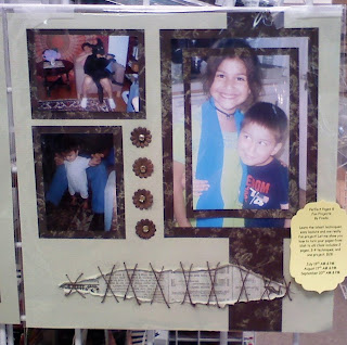
I first tore the paper about 2 inches from the top on one piece, and from the bottom on the coordinating page. Next I distressed the edges of the tear until I had a gap as wide as I wanted and curled them. I had to carefully place the brown strip of paper on the side and cut where the tear was so it could curl together with the cardstock. The idea is that the trim on the side is also affected by the "tear". Try avoid using scissors to get the tear started; you really want a distressed look here. If you use scissors to get the initial tear on the page just make sure you distress the edges good enough so the clean edge from a scissors cut does not show. I used my paper piercer to get the tear started. Put a piece of paper of your choice behind the tear.
Using a paper piercer I poked holes diagonally and then sewed like I was going to sew the tear together. As you can see I used a different sewing stitch on each page.
The next illusionary effect were the main photos. I used 2 photos of the same kind printed, cut and trimmed exactly; they must be exact copies and duplicates otherwise this will not work. First cut out your mat. Then trim the first photo 1/4 inch smaller all around and adhere; you must trim 1/4 inch off all sides, not 1/2 inch on a long side and 1/2 inch on the short side. Then cut the next mat 1/4 inch less all around (you can "cheat" here and cut 1/2 inch on one short side and one long side - just don't do it this way on the photos). Adhere. Finally trim your remaining photo 1/2 inch all around and adhere. I really wish I thought at the time to use pop dots on the 2nd mat and photo; that would look awesome!
Someone thought to cut a simple 1/4 inch frame and place it on top of one photo but the look is not the same.
Those are Bazzill flowers (don't have them yet in my store) and mini jewel brads by American Crafts (we have a few of those in the store).
Enjoy!


Hello there :) Heard about your giveaway, New follower,I think I am number 93 :) Great blog :) Keep posting :)
ReplyDeleteHUGS!
Alex
http://www.youhadmeatcraft.com/
New here!!
ReplyDeleteGreat LO!!!
Keep the grrrrreat work coming!!
http://created2bunique{.}blogspot{.}com
That is a very nice layout. When I first saw it my initial reaction was it was Indian. I am not quite sure if it is the cross sticking or what...maybe the color with the stitching (I never thought of Bazzle flowers as Indian) but any ways it is beautiful. I will have to try that with the photos and I will take your clue to use a glue dot between layers. I love the look of it. Fantastic job. (Maybe it is the little girl with paint on her face....LOL).
ReplyDeleteThis comment has been removed by the author.
ReplyDeleteHey there Sue! I didn't say glue dots, I said POP dots, to make the second layer POP. :-)
ReplyDeleteAnd the reason why my DGD looks Indian is because of the attire. She's a mutt like most Americans; her father is part Hispanis, Japanese, German, all kinds of stuff. Anyway, it was her birthday party and she wanted an Indian theme.
Also, I made cupcakes in a sugar cone for all the kids. Someone dared her to smash it in her face and she took the dare... So that's icing on her face, not paint, lol. Kids!